Atlas Berry Farms Logo
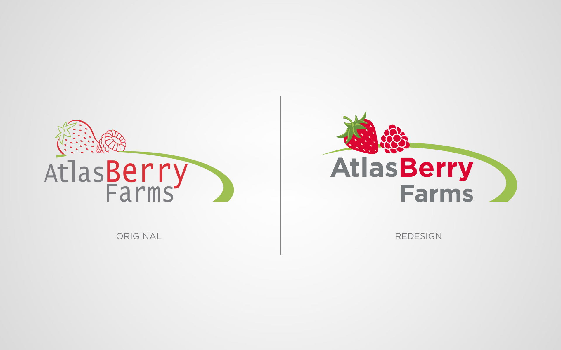
The Atlas Berry Farms logo is a redesign I did for the company. They needed an update but wanted to keep a very similar look for their brand. The thin lines of the original logo was one of their biggest problems. The logo would get lost as a watermark on photography and other materials. All of my concepts included full berries, bolder fonts, and a thicker swash mark. Their final selection is a more professional logo for their company.


